


If you share your printable designs online, you know the thrill and excitement that comes with a model release. You check your profile every few hours to see how it’s doing, read every comment on it, and then see the first community makes of it. But refreshing the model page gets old quickly and it’s hard to keep track of how well the model is doing after just a few days. We’ve implemented a new analytics dashboard, which will give you easy access to all your model statistics in a quick and clean user interface, let’s check it out!
The analytics dashboard
A new tab on your profile will take you to the analytics dashboard. On top, you can see the overview of how your profile as a whole is doing. Apart from the absolute numbers, you can also see the comparison to the previous period. The straight line in each of those graphs visualizes the average value from the previous period.
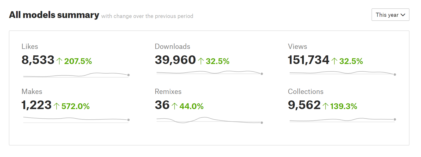
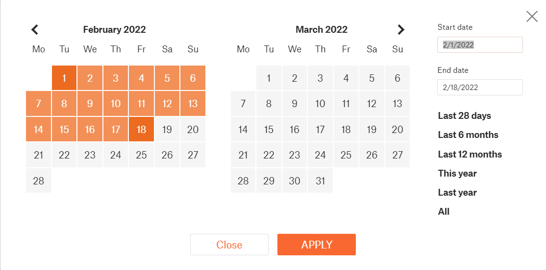
Speaking of the data period, we’re giving you full control. You can use the quick shortcuts to select data from the last 28 days, 6 months, a year, etc. But you can also set up a custom time interval.
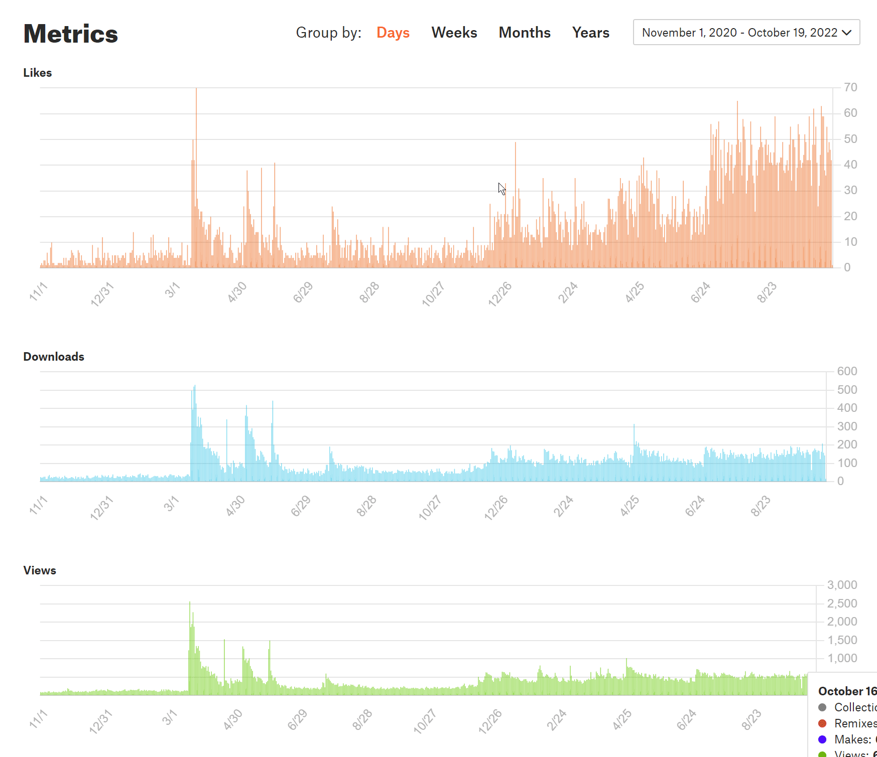
Below the summary, you’ll see breakdowns of individual metrics – Likes, Downloads, Views, Makes, Remixes, and Collections. To make the graphs easier to read, depending on the length of the time period you’re viewing, you can group the data points by days, weeks, months, or years. If you’ve ever used Google Analytics, you can see where we took the inspiration from.
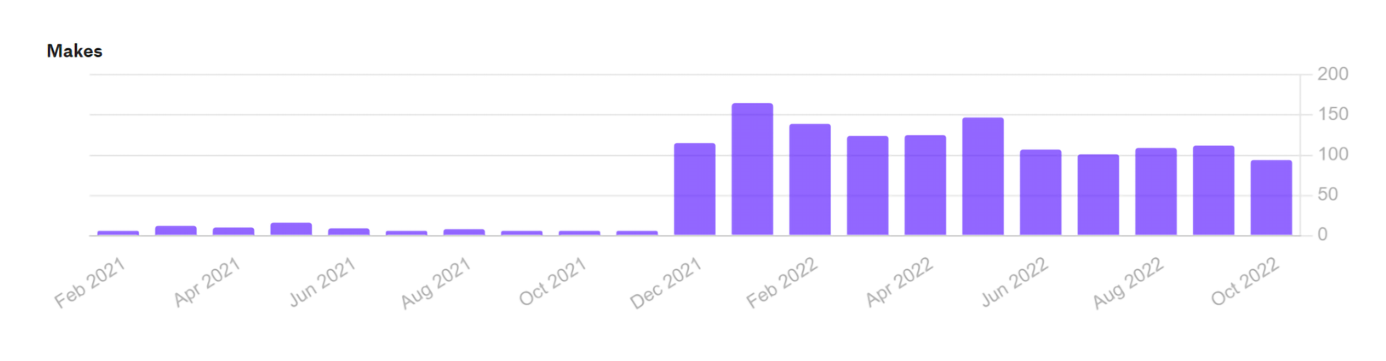
If you’ve been sharing designs on Printables for a while already, a graph that’s particularly fun is the one showing Makes. You can clearly see when we introduced the reward systems and the number of Makes uploaded to Printables suddenly skyrocketed! And it stayed high like this ever since.
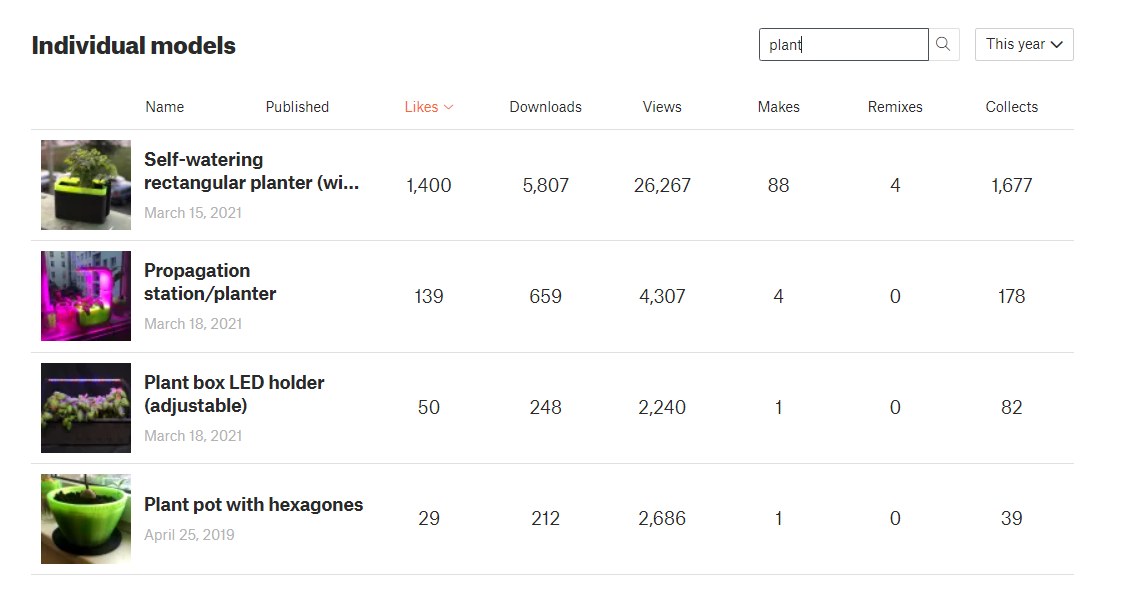
At the bottom of the analytics page, you’ll find a list with all your models and their statistics. All the data here are again from your selected time period. You can easily sort the list to find your most popular model from the past month, as well as your most popular model of all time. There is even a search box in the top right corner, which you can use to filter the models in this table. Especially useful to those designers on Printables who have hundreds of models published already (looking at you, MZ4250).
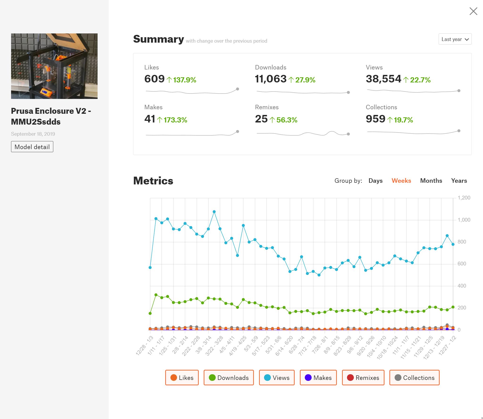
If you click on a model in this list, you can view its detailed analytics. Again, you can filter everything for a specific time period or only look at a few selected metrics. This screen is also accessible directly from the model detail page. Only the author of the model can view its analytics though.
Other changes to Printables.com
Printables developer team
Creating your own model database, like Printables.com, is a huge undertaking that requires a full team of skilled developers. Back when we first started working on it, in order to accelerate the development, our plan was to hire an external company to do the majority of the work, then transition to in-house development over time. The choice for the external developer fell on COex – a Czech company with over 15 years of experience working on large-scale web applications, integrations, information systems, and tailor-made e-shops.
Over the following years, while the project management was in-house, COex was responsible both for implementing new features and for running and monitoring the server infrastructure. Also worth mentioning is our fantastic graphical designer Jan Diblík, responsible for the whole look of Printables. Early this year, we started growing our own internal team and collaborating on the development. Now that we have a full in-house team of web developers specifically for Printables.com, we’ll be doing all the development ourselves. The analytics was the last feature that we developed in collaboration with COex we hope you’ll agree that it turned out great. We’d like to take this opportunity to thank COex for all their work.

The 3D printed company logo in COex’s offices
Server infrastructure – Kubernetes cluster
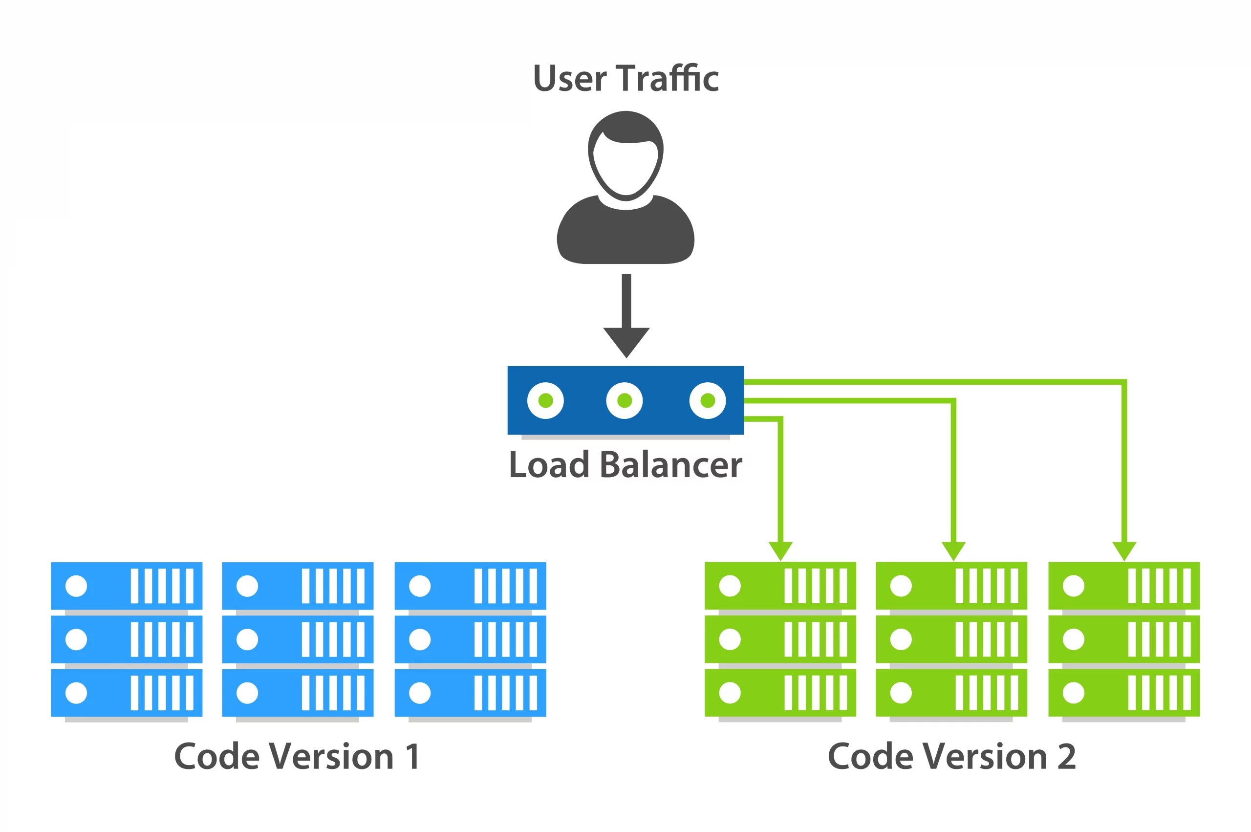
Something that’s not visible to the user is the server infrastructure running Printables. Well, it’s not visible as long as it’s blazing fast! To keep it that way and as a part of our transition to full in-house development and upkeep, Printables now use Kubernetes. This open-source system allows the automatic scaling of containerized applications. What does it mean? Instead of one super powerful server, imagine the Printables infrastructure as a collection of several normal servers (nodes) scattered around the world. If there is increased traffic and these servers are getting close to the limit of what they can handle, a new server automatically starts booting and within minutes, it’s ready to help out and share a part of the load. And once the load eases out, some of the servers will be released again, so we’re not paying for them unnecessarily.
Not only that, but this also allows for zero downtime deployment. When we want to release new features (like the analytics) we can start spawning new nodes and turning off the old ones. So as you’re browsing Printables, you’ll suddenly be getting data from a new updated server with new features.
Of course, it’s not as simple as it sounds. We had to rewrite some of the Printables source code, so the website can run in a container. This wasn’t without its problems and we had a few outages as a result of that. But in the long run, this should ensure Printables will always be quick, responsible, and with minimal downtime.
Small fixes and optimizations
We have significantly lowered the load on the CPU when browsing the model database. This improves the responsitivity of the site and lowers the battery drain of mobile devices. We have also fixed several bugs – including wrong text wrapping around images, wrong display of the 3 highlighted badges on a user profile, and a couple of UI fixes for messenger on mobile devices.
We have more new features to come, some of them are small improvements, but some are big new features we can’t wait to show you. Until then, happy printing!
Very cool! Works pretty well, and is a feature i was missing. Now to the real question… What about the XL ? Any news?
Agreed.
And to add a little to your question, if you (the Prusa team) could please somehow address the payment options on your eShop. It used to be that you could pay with various cards (up to 6 cards are listed for me), as is stated in the payment method on you site, but when you got to the actual site that you enter your card information, you can only enter information for three cards. I hope you or your partner brings back other card options.
Thank you
Really cool, thank you! I’m glad I picked printables as my first 3D printing site.
I’d love to see a dark mode option. I really struggle spending time on the site without it, especially on mobile.
I am really happy to see that you added an analytics tab, I’ve been really waiting for such a feature! One little suggestion though: I think it would would be very convenient if the legend header of the “Individual models” panel (likes, downloads, view etc.) would follow staying on the upper screen edge while scrolling down. This would help to keep track of which column displays which value (especially on mobile devices).
Good tool to see what types of models other users are actually looking for.
Nice presentation lengthy and thorough. Now that finally you have a bit of free time after all this information, can you write a small paragraph about the state of the XL situation. I mean obviously you have a strong blog writing and analytics team. Use them. No we dont blame you for the shipping problems. We blame you for you lack of updates.
I have a suggestion for Printables website! Please unhide all collections by default at least for PC. We must click “see all” every time to look through our collections.
Prusa Team,
please support designers by introducing option to pay for models. I know this is not a popular concept here at Printables, but without incentive there’s no innovation. Save us for the tyranny of monthly subscriptions!
The analytics feature was much awaited! thank you…!
cheers
You can at least add a PayPal link to your account – https://www.printables.com/profile
Awesome addition to printables.
Is there any chance for new model moderation? There is a flood of random useless models.
My analytic is not working, I added a make and did not received the full reward and the next one received half of the previous. The analytic is a great innovation but my screen is showing absolutely nothing, i guess something is wrong?
Jiu-Jitsu is the best martial art. It is a very effective way of self defense and it teaches you to get out of situations that are not good for you. It also helps you lose weight and improve your health. The first thing that you should know about Jiu-Jitsu is that it was developed by the Japanese Samurai warriors around 1600 AD. Additionally, bjj academy near me used this martial art to protect themselves from their enemies, including other samurai warriors who were trying to kill them. The samurai warriors who practiced this art were able to defend themselves against even the most powerful of their enemies because they were trained in many different types of fighting styles such as karate, judo and kung fu.
Web design Marietta is the process of designing the graphic user interface and visual style of websites. Additionally, web design marietta includes considering a website’s technical requirements from a functional and usability perspective. This requires a good understanding of how web technologies work and interact with each other.
Really difficult to find a place to report issues with the Printables website…
Recently the analytics views have lost the ability to report on any timeframe other than 28 days.