In the past few months, we’ve introduced many new features that we’re now excited to talk about. Many of them were implemented based on your requests, such as a more advanced search function, clickable tags, or new rewards. But first, let’s take a look at something you might not have expected – the brand new Community Feed.
Community feed
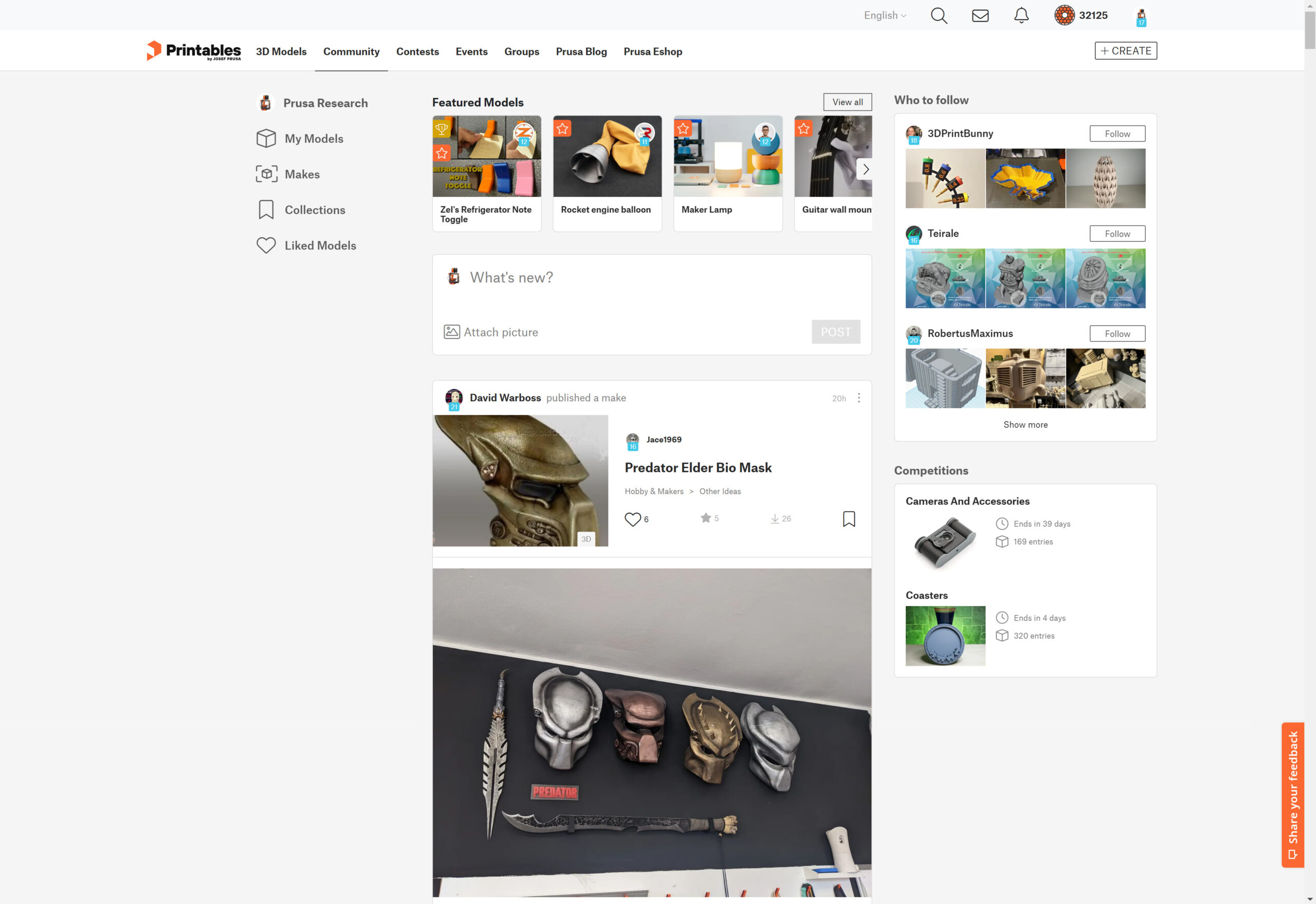
As the name suggests, the community feed lets you see the activity of users you follow. Whether it’s designers uploading new models, users publishing a make, or, for example, adding a model into a collection.
It’s a fantastic way to discover content on site. You will never miss a new model from your favorite designer again. And vice-versa, designers can build up their follower counts and be sure their models will get the attention they deserve. You will see Makes that other people upload, models they like and more! You can even create standalone posts for your followers, for example, show them progress on a new model or ask them for feedback.
You can follow friends and they can follow you to see each other’s designs and makes easily.
This is something we wanted to implement from the very beginning, but it required getting a lot of other features done first. Such as the mentioned uploading of Makes. The Community feed brings with it several changes, which we were silently introducing to the page. You can now like Makes and comments, which is just a nice and quick way to react to them. And we redesigned comments so the same visuals would work well both in the community feed and in the model’s comment section.
To get started, you can use the right panel to find suggested users to follow. It’s a mix of users who are followed a lot by other users. And of users that follow you, but you’re not following them. Taking into account their level and the number of models they’ve published.
We do all sorts of optimizations, so your feed is not spammed with non-relevant posts. To give you a few examples. If several users you follow like the same model or a Make within 3 hours of each other, it will only show it once. If someone creates a collection, we wait until it has at least 4 models, because sharing an empty collection is not very interesting. And if someone imports a lot of models from Thingiverse, it creates one post with all of them, rather than spamming the feed with many new models at once.
You can check your own activity in a new tab on your profile. If you for some reason don’t want others to see your activity, you can prevent people from following you in your profile settings. If someone was already following you, they will also no longer see your activity.
If you’re browsing Printables on the go, we made sure it will work well on mobile devices. You can even add it as a progressive web app to your home screen.
Search improvements
Based on popular demand, we’ve implemented several improvements of the search function.
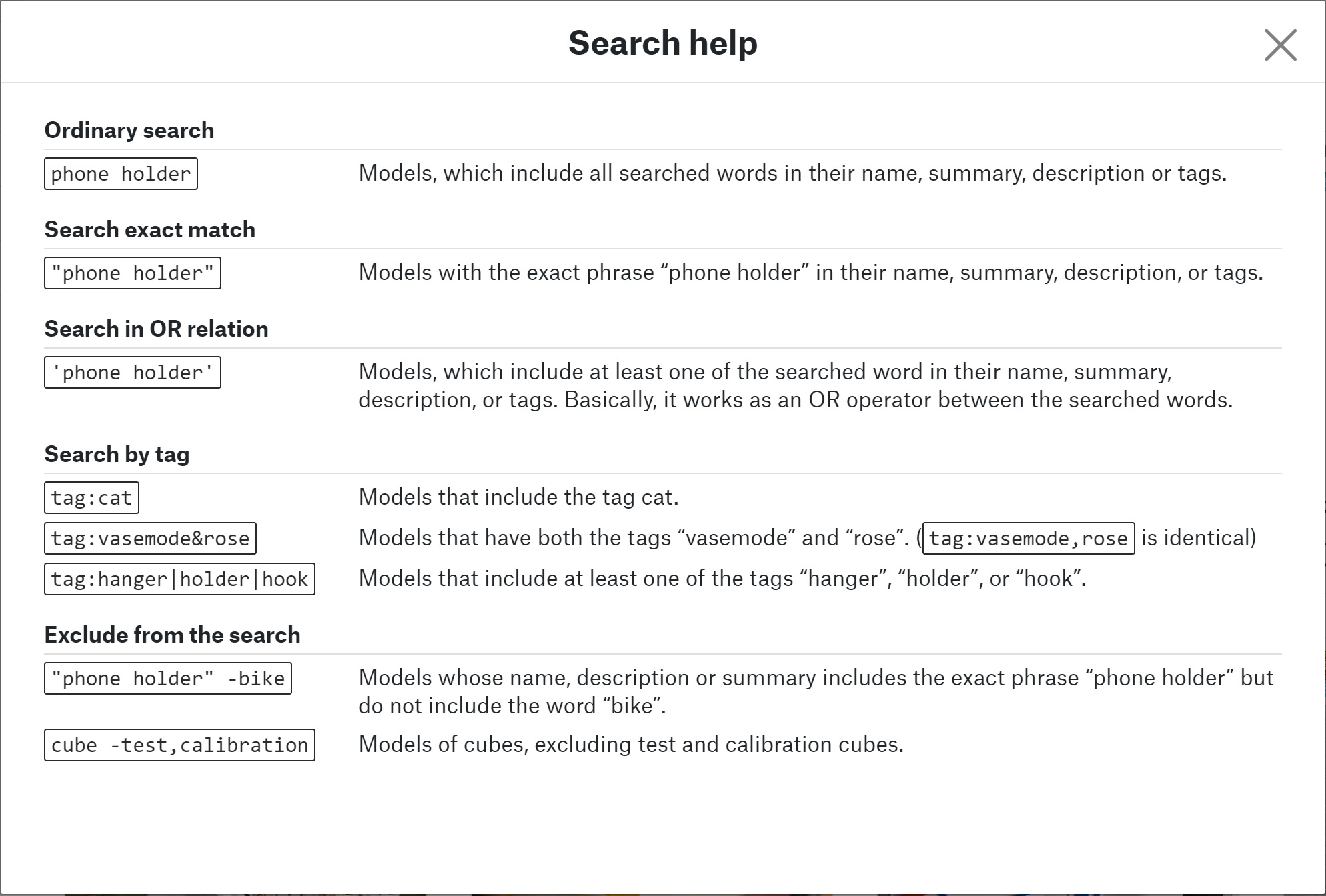
You can now use quotation marks to search for exact matches of the phrase. You can exclude results using the minus operator. And you can search for models with a specific tag. Another way to do that is to simply click on an existing tag on the model’s page.
Examples:
“phone holder” -bike
Models with the exact words “phone holder” in its name or description, that do not include the word “bike”
phone holder tag:keychain
Phone holder models that include the tag “keychain”
You can use boolean operators to search models with multiple tags. Both a comma and the ampersand symbol work as an AND operator, which means the model must have all tags that you listed. On the other hand, the ipe symbol works as the OR operator, meaning at least one of the listed tags must be included.
tag:vasemode&rose
Models that have both “vasemode” and “rose” tags
"tag:hanger|holder|hook"
Models that include at least one of the tags “hanger”, “holder”, or “hook”.
We will add a list of these advanced search operators directly to Printables, so you can always look them up when you need them.
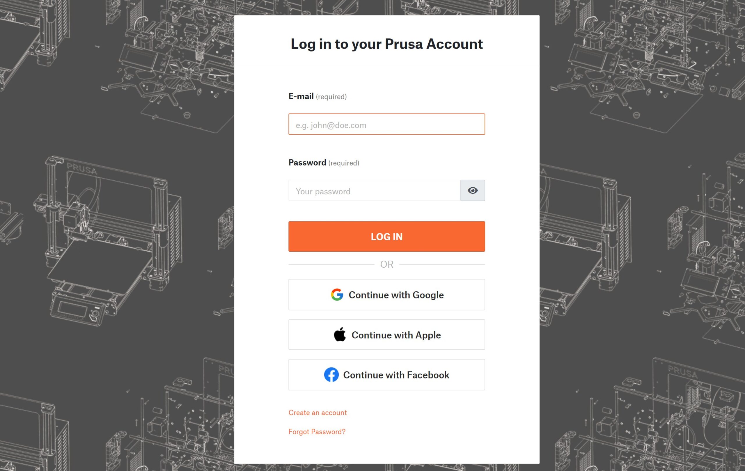
Login with Google, Facebook, or Apple ID
Prusa Account has new options to log in and register using Google, Facebook, or Apple ID. Creating an account is now even quicker and without having to remember yet another password. OAuth, the open-standard authorization protocol that Google/Facebook/Apple use, doesn’t share your password data with us. All we get from these services is your email address, profile picture, and authorization token.
One thing that most websites ignore is the possibility of linking or unlinking these accounts at a later time. We took our time to do this the right way. You can connect your Google/Facebook/Apple account to your existing Printables account at any time. You can then use any of the connected services to log in. And if you later decide to don’t want to use them anymore, you can unlink them again.
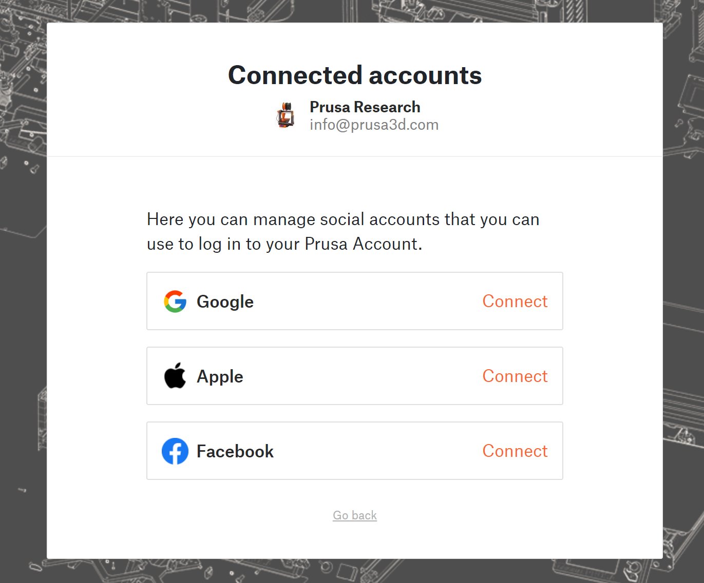
One last interesting thing is how 2-factor authentication (2FA) works with these connected accounts. If you’re logging in using your email address and password and have 2FA turned on, it will work exactly the same way as before this update. You will be prompted to insert the one-time code from your authenticator app. If you’re logging in using Google/Facebook/Apple though, it’s up to that service to verify your identity, so you will be prompted with their 2FA, assuming you have it turned on there.
New rewards, an event visitor badge and improved UI
We have added a new badge you can collect! With the covid pandemic easing off and trade shows and events slowly coming back, we thought it would be great to create an Event visitor badge. When you visit a 3D printing event that the Prusa Research team attends, you can look for a Printables.com rollup banner with a QR code to get the badge. And you can progress the badge to higher levels by visiting multiple events. We already tested this at TCT 3Sixty in Birmingham and at MRRF 2022 in Goshen, IN and the first users already got their badges. 🙂 In the future, we’ll add to each event listing on Printables whether you can find the QR code there or not.
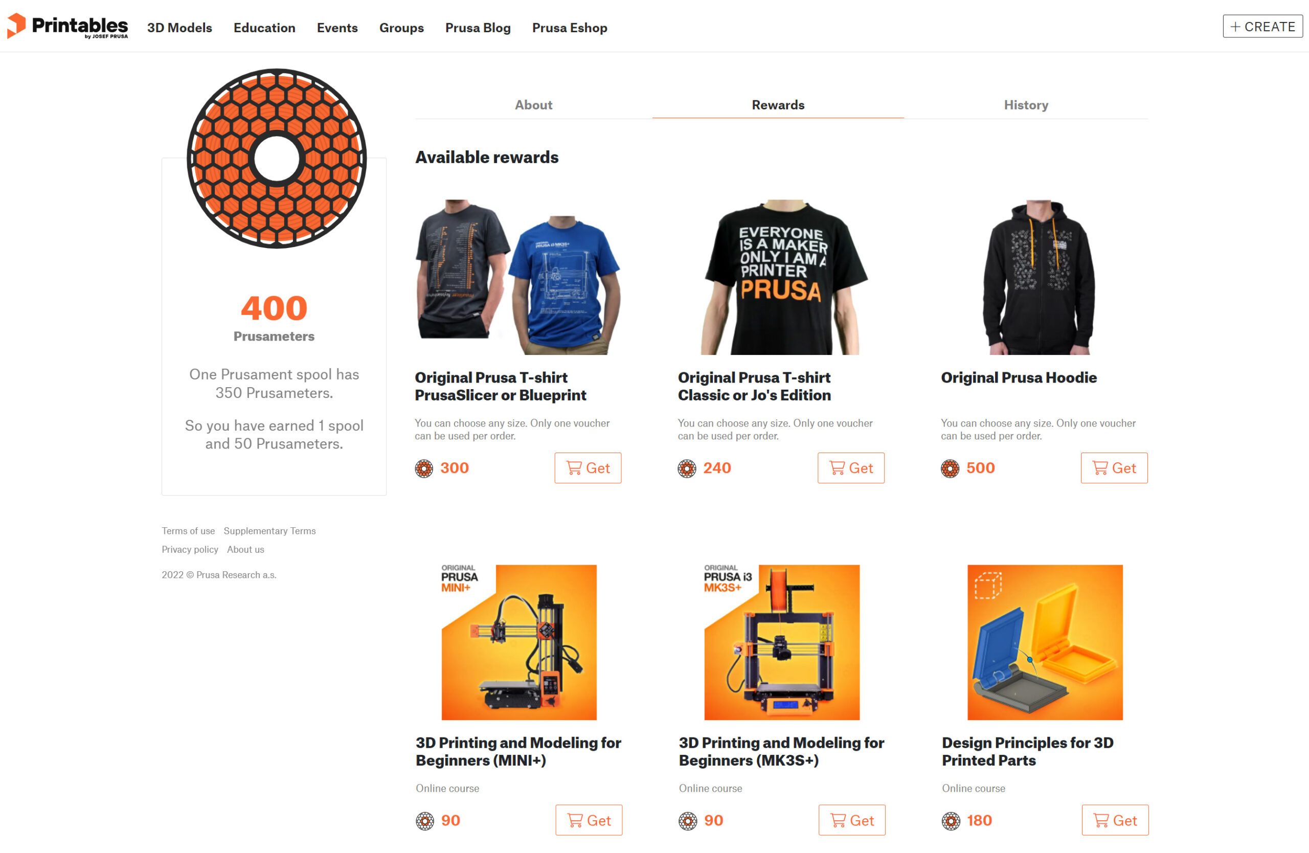
When it comes to spending your hard-earned Prusameters, you can now exchange them for the two new T-shirt designs. One is a wearable PrusaSlicer keyboard shortcut cheat sheet, and the other features a blueprint drawing of the MK3S+. The PrusaSlicer keyboard shortcut design is also available on a handy mug. You can also exchange your Prusameters for all the courses available in PrusaAcademy, including the Design Principles for 3D Printed Parts course.
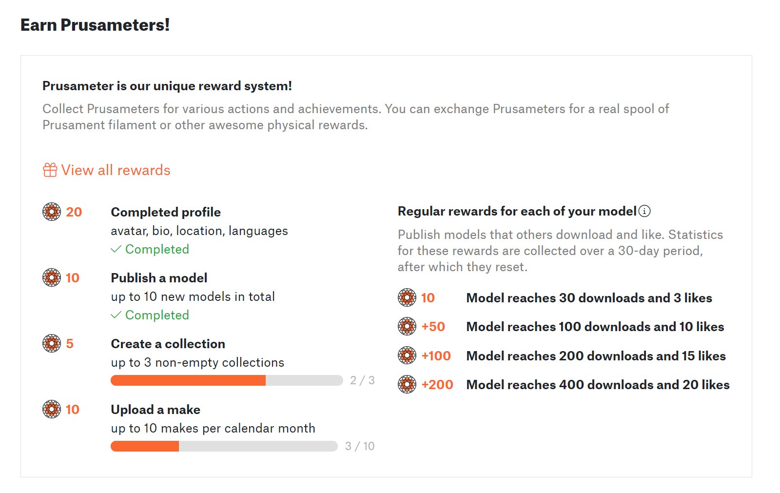
We’ve improved the UI of the Prusameter reward system to make the rules a bit easier to read. There are now progress bars under each task. Once you finish them, the rewards get the “Completed” tag. And the monthly Make rewards progress bar is automatically reset each month.
Improvements on user profile
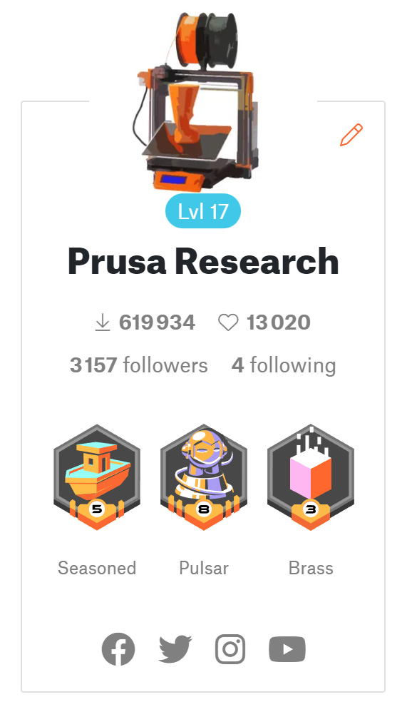 You can now see not only the total number of downloads of all models the user has uploaded but also the number of likes those models received. Below these values, you can see the number of followers and followings, which we expect to grow quite a bit with the new Community Feed.
You can now also add links for your social media accounts to your Printables profile. This will make it easier for your fans to follow you on all your active channels, especially if you’re not using the same nickname everywhere.
Other smaller improvements
Thingiverse import date
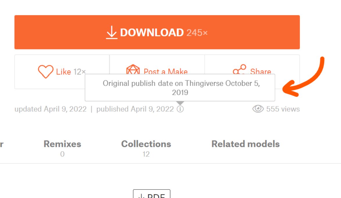
Based on requests from several users – models imported from Thingiverse now have the original publish date visible, as well as the date it was first published on Printables. So even if the original upload is no longer available, there will be no doubt about when was the model first published.
Better translation system
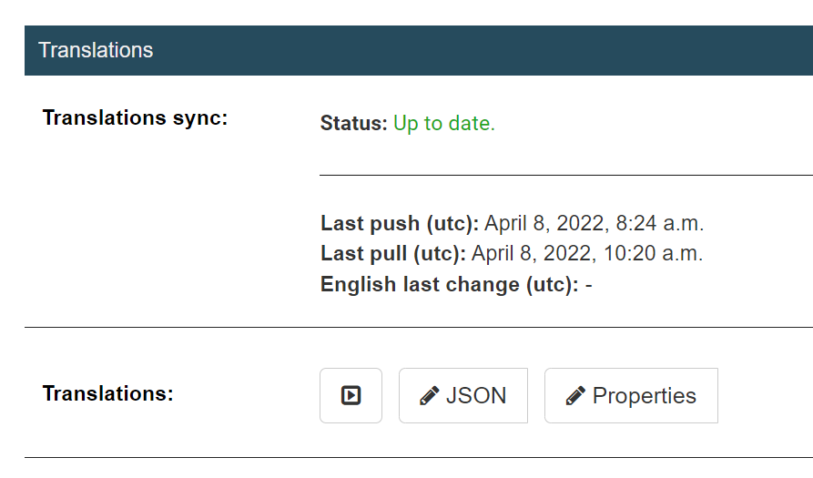
Sometimes, it’s the changes under the hood that get us excited. We have a new Translations section in the website administration. We can now easily “push” a section of the page and the translation will automatically appear as soon as our translators have finished working on it.
New menu items
Two new items were added to the main menu. One of them is the mentioned Community Feed. The other is a shortcut to get to the design contests overview. We feel that the contests are becoming such a popular part of Printables, they deserve to be right there in the main menu.
And there are countless smaller improvements (e.g. a new Make icon), bug fixes, and speed optimizations.
Your feedback guides the future of Printables.com
We’re very excited to hear what you think about the community feed and about all the other features we’ve added. We’ll be continuously updating the Community Feed and we have a couple of other new features already in the works. If you have an idea on how to improve Printables, we’re always happy to hear your suggestions.
Stay tuned for more Printables.com developer logs, you can follow us on social media, where we post updates whenever we add a new feature. And we even have a subreddit r/printablescom now.
Happy printing!


I think the Community feed is a great addition. However, I’ve noticed that it’s very “noisy”. Would love to see a filter function (with my choices remembered). For example, I love the idea of having all new models or updates to existing models of designers I follow in one place. However, I couldn’t care less for what models or makes they like or not. And right now it seems most things in my feed are those likes ☹️
Confirm the noise, at the moment I have to much clutter I can’t filter so I don’t use the new system. I’am interested if a design I liked or downloaded or even postet a make changes somehow.
But it’s new and fresh, we will see how it’s grow.
I’m struggling to find how to get back to the blog listing from any blog entry such as this one with one click. I either have to click several times to navigate back to the listing of blogs or manually edit the URL line in my browser back to blog.prusa3d.com.
Yeah, this is annoying us too. We have adjusted the menu layout and will deploy the change soon.
I was at MRRFX but I didn’t scan the QR code. I do have my voucher code and some photos of your display as proof I visited if I can get that sweet badge unlocked.
I’m getting “Something went wrong. Please try it again later.” for the Community Feed.
Search: It’s easy to filter for contest entries but how do we filter to *exclude* contest entries?
Hey team and Mikolas! 👋
The search features are outstanding, thanks !
I tend to agree with user @fuchsr about the filtering of the commu feed. However it’s a broader issue than just “like” noise. The issue is complacency and the overall abuse of the like button. How many times do you find yourself hitting the ❤️, not because you fundamentally like the object/statement/publication but just because you’re happy that someone merely made the effort to post a make of your object, albeit a terrible one. 😞 I’m all for positivity and being kind to each other but too much hypocrisy, careless reciprocity, social pressure and herd behaviors are eventually detrimental. Many major social platforms are now moving away from the heart cult for something slightly more semantic by offering the possibility to react through multiple emojis. Sometimes it’s a limited set (e.g. GitHub, FB), sometimes it’s more liberal (Discord, Slack) and even allow for multiple _reactions_ per user. Admittedly emojis carry their risk of interpretation uncertainty and misunderstandings. Some Discord reactions sections tend to get crazy every now and then but overall I think that the path of multiple, free, emoji reactions brings more sense, more balance and finally *more value* to our online interactions.
Please ❤️ my comment in replies, 😭 on it, set it on 🔥, 🤣 or 🤮 at it ! Hell, why not 🦤 it ? I’m sure I’ll get what you mean!
P.S. Also follow me. For no reason. Suckers. Please. 🥌
Hi,
those are some incredible features, it is so cool to see you helping this much in growing the community.
One little thing I would add is sorting of “Rewards” available for prusameters. If you decide to add more available rewards, it would be great if we could sort for example by “price” of the reward.
I love the improvements you make, and I love that you’re listening to community feedback for those improvements. Keep up the great work!
That said, would it be possible to increase the number of collections a user can have? Currently, the cap seems to be at 20 user-created collections (+”Liked models”) – and since I like to split my collections into subcategories once they grow too big, I constantly keep hitting that limit. If the reason for the limitation is to prevent spam, why not just limit the public collections and make the number of private collections unlimited…? Just a suggestion.
Terrible UI.
Following and being followed is about *me*, so it should be under the nameless menu that hides below my profile picture, where all the other stuff that is about *me* is located, too.
“Community” is the term for “stuff the Sirius Cybernetics marketing department wants people to see first”. The (non-suppressable) “featured models” stuff is, seen through the eyes of an engineer, all cringe materal … trivial low-tech designs made “cute” (and, usually, inefficient) by making them ornamental. Great for coaster collectors and figurine petters, painful for an engineer and old-school nerd.
It doesn’t need to be on top of *my* page anyway, because it’s on top of the printables.com landing page anyway. Why hurt me twice?
I realize that the UI is still under development, and may represent something like the first baby steps of progress over the important “minimum viable product” milestone, but I thought I’d mention engineer culture better early than too late. “Community engagement for average consumers” won’t cut it with engineers or computer scientists. One of their credos is “If you can switch it off, it is a feature”. You can’t make these guys and girls happy if you railroad them with the best of intentions … you have to give them some measure of control.
(Note: Half of the posts above ask for more control … you can see that’s very much a part of the maker mindset, engineers or not 🙂
Thanks for listening to my rant, I’m certainly a very happy Printables user 90% of the time, and look forward to see it evolve into something even more amazing in the future!
“If you have an idea on how to improve Printables, we’re always happy to hear your suggestions”
As Michael Parmeley said in a facebook reply to this post, it would be great to have a place to submit suggestions. Is there an issue tracker or feedback form or something?
In particular, I would like to see better formatting of reviews/comments on printables.
For example, when you start a new paragraph, that formatting doesn’t show up in the final comment (although the line breaks seem to be preserved in editing mode?)
I’d also like to be able to use inline links, rather than having to just paste big urls in brackets.
Camping in Louisiana is an exciting experience. Whether you want to explore the Great River Road or visit the bayou, there are plenty of great places to stay. Tiger Island State Park – Located on the Pearl River, this park features a variety of camping options including full hookups and backcountry campsites. Try this best campgrounds in louisiana for more ideas. There are also many hiking trails and trails for biking as well as fishing and boating activities. There’s also an excellent restaurant on site that serves breakfast, lunch and dinner seven days a week. The restaurant offers both indoor and outdoor seating areas so you can choose what works best for you and your family.